Some sort of marketing bullshit generator I assume by the text of the post?
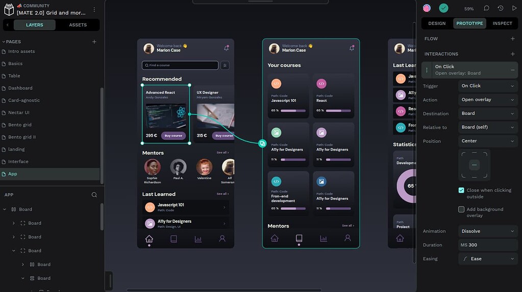
This blog post is pretty buzzword-heavy, but Penpot is a legitimately great tool. It’s used for UI design and layouts. I’ve seen a couple of open source projects use a self-hosted Penpot instance for working on and discussing new designs.
Figma would be the most popular, proprietary example of this type of tool. I’m not aware of any open source competitors besides Penpot.
edit: It’s like Google docs for web page layouts or app layouts. The animation on their homepage is probably the best way of showing what it does.
I hate when i have to go 4 links deep to get an explanation of what it even is.
Penpot is the first open-source design tool for design and code collaboration. Designers can create stunning designs, interactive prototypes, design systems at scale, while developers enjoy ready-to-use code and make their workflow easy and fast. And all of this with no handoff drama.
It doesn’t explicitly say so but it’s apparently for people who make web sites. Who would make anything else anyway (I suppose).
It’s vector art. You can design all sorts of things. App layouts, website design, logo design, basically anything that is visual and will need to scale up and down without loss of detail.
That kind of information would potentially be useful on their site’s front page.
Like most FOSS projects… they’re awful at promoting what they actually do on their website front page, instead focusing on FOSS buzzwords. It’s unfortunately a thing.
Is… is this the comeback of WYSIWYGs?
Quite cool!
Those OSX screenshots really are selling me on this being a FOSS thing I could get behind /s NOT!!
Looks cool! :)


