• 2 Posts
  • 8 Comments
Joined 1 year ago
cake
Cake day: November 21st, 2023

help-circle
  • For nonidentical devices you create additional packages prefixed with specific device name. You don’t need to link all packages at once with stow, pass a name of a package to link it alone.uuu

    Sooo… I find some way to share the dotfiles directory across devices (rsync, syncthing, git, nextcloud, DAV) then make specific subdirs like this?:

    ~
      - dotfiles
          - bash-desktop
             dot-bashrc
             dot-bash_profile
          - bash-laptop
             dot-bashrc
             dot-profile
             dot-bash_profile
    

    But what is the software doing for me? I’m manually moving all these files and putting them together in the specific way requested. Setting the whole thing up is most of the work. Anyone who can write a script to create the structure can just as easily write it to make symlinks. I’m sure I’m missing something here.


  • yadm is the one I liked the best and tried it a few times. fact is that I am unlikely to keep a repo like this even part way up to date. New files are created all the time and not added, old ones don’t get updated or removed. There’s not even a good way to notice in any file manager what is included and what’s not as far as I know. yadm doesn’t work with tools like eza which can display the git status of files in repos. (and it probably wouldn’t be feasible.)

    Plus I have some specific config collections already in change tracking and it makes more sense to keep it that way. Having so many unrelated files together in one project is too chaotic and distracting.

    It’s not realistic for me to manage merges, modules, cherry picking, branches all that for so many files that change constantly without direct intervention. Quickly enough git will tie itself into some knot and I won’t be able to pick it apart.



  • Could be using CSS position: fixed. But idk there could be other more sophisticated ways to accomplish the same thing.

    In terms of why to not use it, I can think of reasons to avoid it by default. Like it could be very annoying on some devices in some situations. If the page authors made the table headings really long, it could obscure the content. I know I have been annoyed by this sort of thing when websites use position: fixed for their navigation or other elements. When I’ve snooped around the backend of wikipedia I see that they are contending with a wide variety of contributors and users and whatever they do needs to accommodate everyone.

    What I find surprising is that there is (apparently) no 3rd party browser extension, userstyle or userscript that allows enabling this.


  • Thanks for taking the time! But it doesn’t properly reproduce the content.

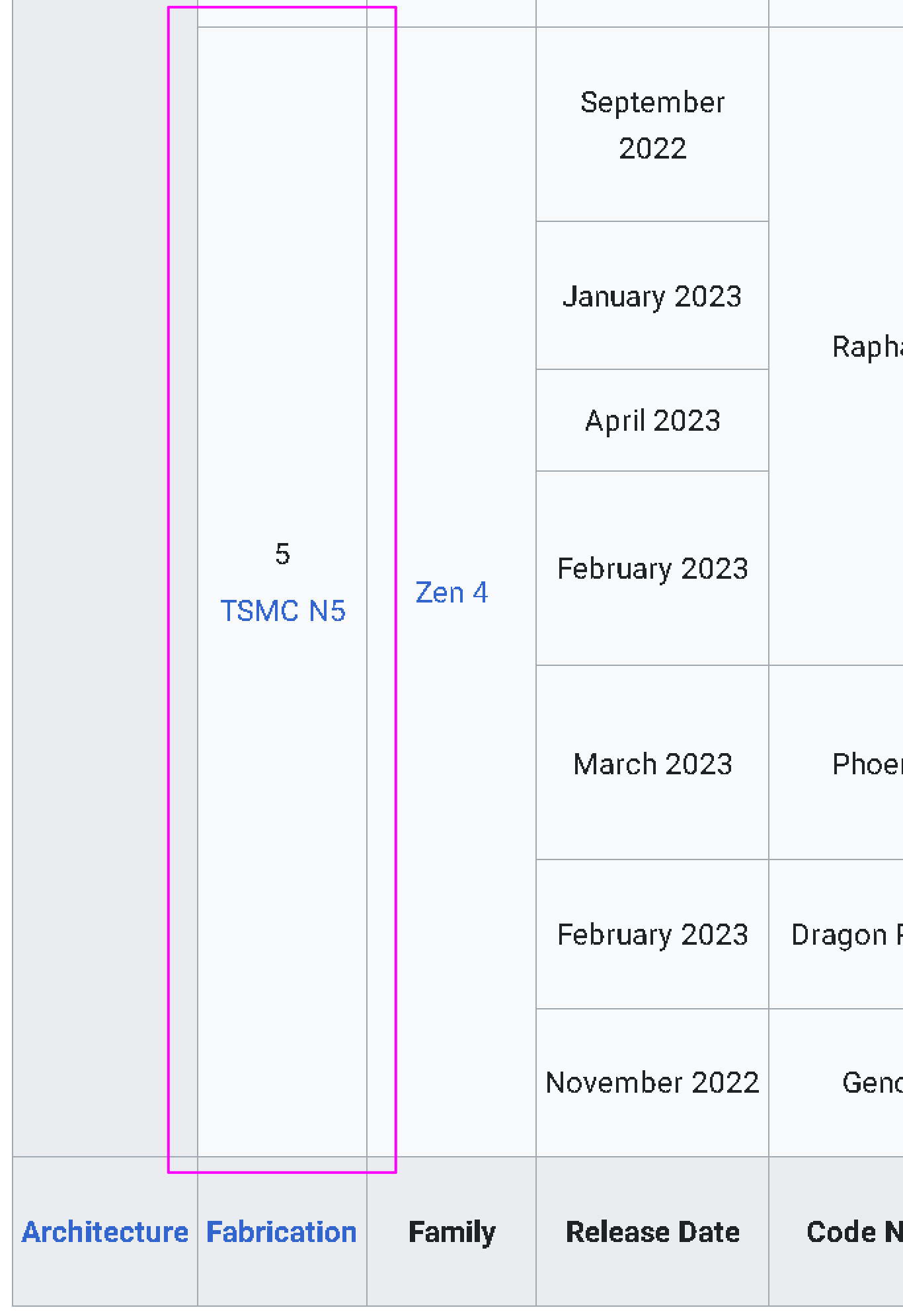
    As an example, here is the very bottom left corner from the wikipedia:

    there is a merge row with content “5 TSMC N5”. Same height as merged row in next column, with content “Zen 4”.

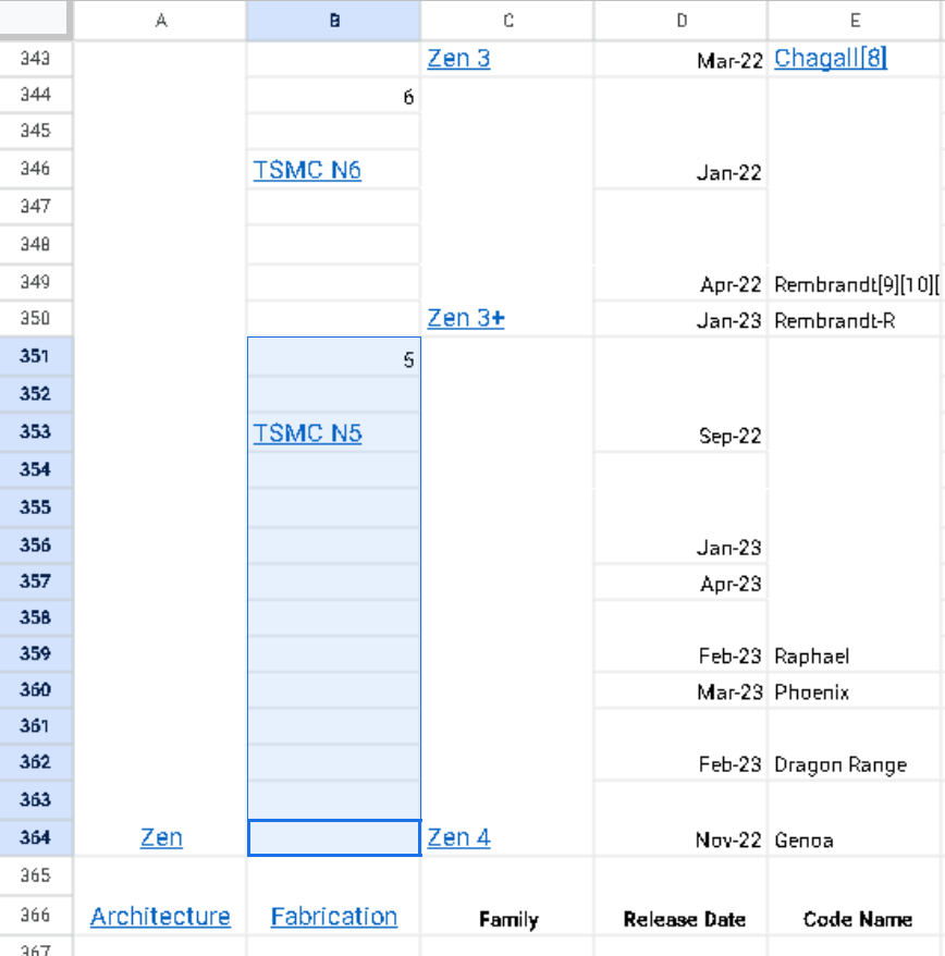
    But in the google sheet:

    those row containing “5 TSMC N5” have all be un-merged into 14 separate rows. However for some reason “Zen 4” has been properly copied?

    I would need 2+ very large displays to compare the two documents side by side but from what i can see on my 1 small display there are many such inconsistencies. My experience is that cleaning up the data is impossible.