Bloody hell yes. I have to select text on my phone all the time and that little hovering Android context menu is utterly atrocious. How that passed any UX process is completely beyond me.
- It hovers over text, rather than appearing in a predictable location like every other context menu in the OS does.
- The menu just doesn’t appear sometimes. Usually when the selected text is large or near the edge of the screen or the screen is zoomed in.
- It’s unstable. Every time you bring it up, the context sensitivity might add additional options. That context sensitivity is good, but it also means that one has to scan the menu for the desired option every single time, no matter how proficient one gets.
- It’s uncustomisable. One of my most-used options requires me to select the text and wait for the menu, tap the three-dots to open the second layer of the tiny little context menu, scroll that tiny sub-list past a bunch of less-commonly used options to the option I use all the time, then tap on that. The menu is sorted arbitrarily, not even alphabetically, and is completely unmodifiable.
- And what is given sort-priority over my actually used context menu items? “Share”. I can share text with two taps, which I will never do, but the action I use dozens of times a day requires three taps and a scroll to find it.
Gods have mercy on your soul if the selected text handle appeared near the screen edge and you need to adjust the selection. If you’re using gesture navigation, 4 out of 5 times it will think you’re trying to navigate away. Goodbye all the text!
This comment raised my blood pressure.
While I like the back gesture, it does interfere at the worst of times. Text selection and scrolling an ebook sideways for example.
And this is yet another reason why the whole reddit app thing has two clear sides, annoyed people and dumbasses. Several apps try to make text boxes slightly more manageable, some padding and whatnot. They store text even if the app crashes. Stuff like thata. And the official one doesn’t.
^ this ffs
This post really shows how old I am, because I immediately thought “does anyone actually compose on a mobile device?” The experience is so bad I limit my own mobile compositions to message responses like “k” and “lol”.
I wrote this comment on my phone and it was an awful experience 🙃. But hey, at least my keyboard app suggested a silly emoji…
I’ll continue to do my “real” writing on my desktop for now. Integration apps like KDEConnect have been enough for me to get by, but they aren’t perfect either.
I’ve got a folding phone so I can unfold the screen into a small tablet and it’s so much easier to type on it.
It would be nice if Samsung would put decent cameras in the fold, but I’m still going to get another one because I’m not going back to a teeny tiny screen.
I tried the F(x)tec Pro1x earlier this year in the hopes that it would unlock some writing productivity for me with its built-in keyboard. I managed to get one really cheap, but it (like many other “exotic” phones) had so many cellular network connectivity issues that I gave up. I now have a Samsung Galaxy A54 with GoogleFi. The typing experience sucks but at least I can make / receive calls…
Don’t import phones it’s a waste of time, particularly if you’re importing into the US because for some reason the US has this weird standard that nowhere else uses, because reasons. But that’s just an issue with imported phones in general.
But most importantly, fixing text editing isn’t seen as important enough in the war between Android and iOS. It’s not the flashy feature that shifts your Net Promoter Scores.
This kind of stuff is exactly why I hate non-free hardware and software, it kills experimentation. It sucks so much that there are no good options for free mobile phones. And for this you wouldn’t even have to free your software, you’d simply have to give the user the ability to tinker with their OS outside of the walled garden that is the app-store filled with these shitty cash- and data-grabby webapps.
Nah man, I’ve been told by rich people that competition under capitalism is the only way humans can invent anything ever!
deleted by creator
deleted by creator
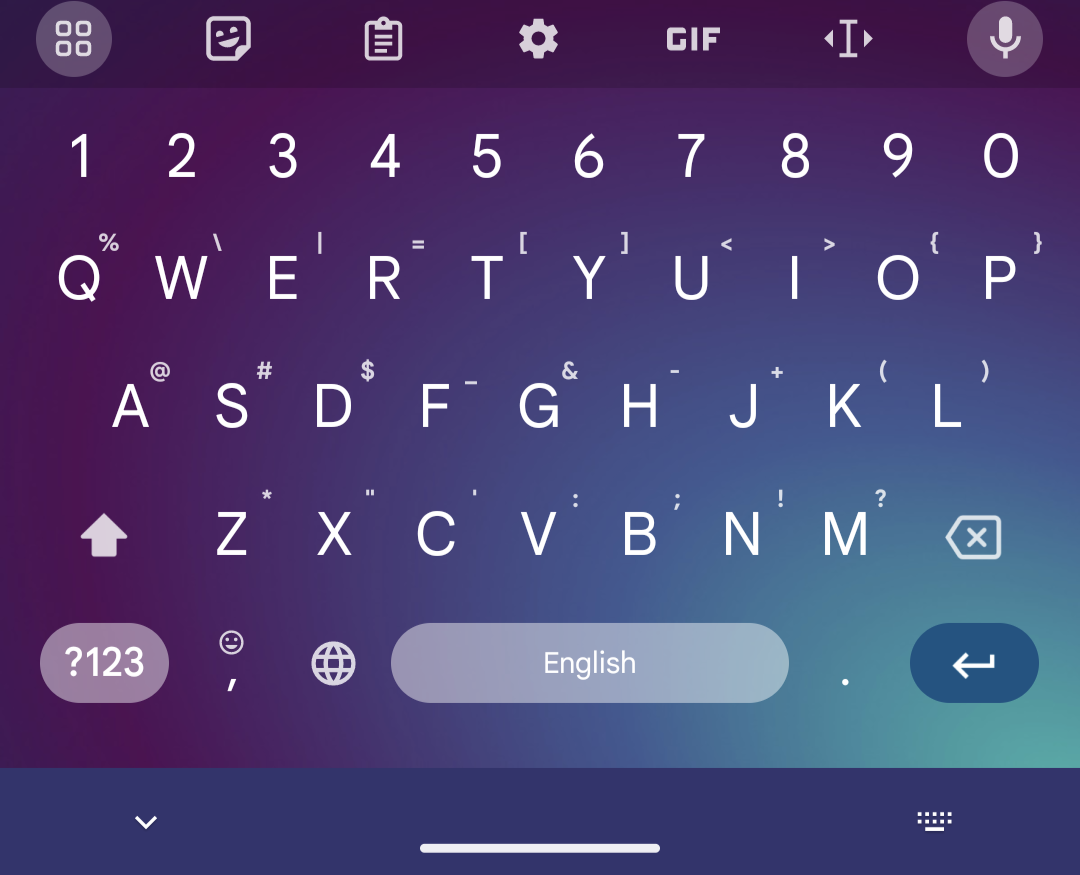
OpenBoard does allow to use the spacebar to position the cursor. Holding it down and den swipe left or right to move the cursor.
That was originally a Gboard feature but it’s great, so every decent keyboard supports it now.
One thing I really like about the iOS keyboard is that doing that can move the cursor in all directions. On Android keyboards, dragging the spacebar can only move it left/right.
Agreed, there’s enough room to go two lines down and many up. Android can already go up/down without issues if you have a keyboard with arrow keys, so keyboards would just need to implement the gesture.
IOS also has contextual tab buttons that are very nice. I wish other companies would copy the things apple does well instead of the bullshit they actually copy.
IIRC only iOS has that because apple holds a patent on that specific implementation. Which sucks because on Gboard the space bar can be quite small and the timing between activating the cursor scroll and opening the language menu seems like 0.15 seconds
@WestwardWind@lemm.ee SwiftKey on Android also supports moving the cursor in all directions.
deleted by creator
It has both by default. If you hold, you get the language selector but if you swipe, it moves the cursor. Gboard also has some acceleration on the swipes which makes them wildly imprecise, now I use florisboard which doesn’t do that.
deleted by creator
I’m not sure what the defaults are on Gboard because I’ve tinkered with the settings a lot by now, but you can have both long press to change language and swipe to move cursor at the same time, they don’t really interfere with each other, I just did both while writing this comment.
Also I’m not sure how many people have more than one language enabled on their keyboard, I’m admittedly not in a great position to judge that as an American since not too many of us speak more than one language with any regularity or fluency. A lot of people don’t tinker with the settings too much and for a lot of languages that use some variant of the Latin alphabet using the keyboard of your main language is probably sufficient for most other Latin alphabet languages in like 99% of cases. I suspect a lot of people don’t bother (though I’m happy to be proven wrong)
deleted by creator
Wait, what? How did I not know this? That’s great!
I use Gboard which does the same, but I also have multiple languages enabled which you switch by long-pressing the spacebar and I regularly trigger the wrong one - very annoying.
Did you try enabling the separate language switch button? It may be better that way
Hacker’s Keyboard has arrow keys, shift, ctrl, alt, and escape. This isn’t a limitation of phone keyboards in general, just the poor design choices of most stock keyboards.
Man now I want those too. Can you call up the keyboard manually to use them outside of text entry?
Hacker’s Keyboard has an option for a persistent notification that can be used to bring up the keyboard whenever you want. On mobile Linux, at least on Phosh (which is the environment that squeekboard is a part of) there is a button on the bottom bar that pulls up the keyboard whenever you want it.
Neat! Thanks
deleted by creator
deleted by creator
deleted by creator
deleted by creator
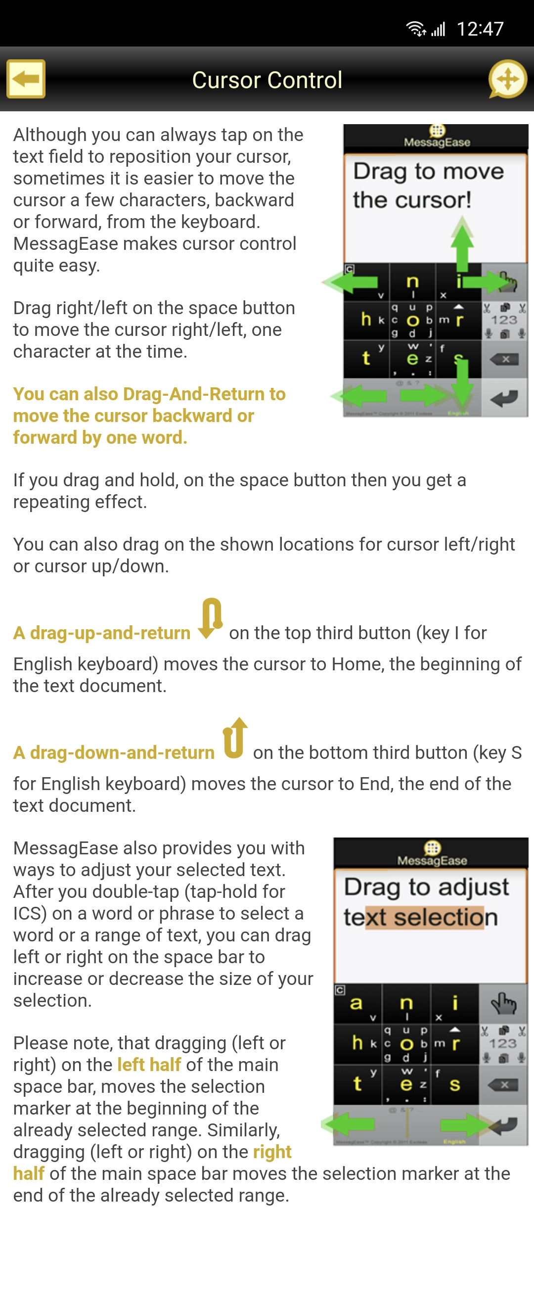
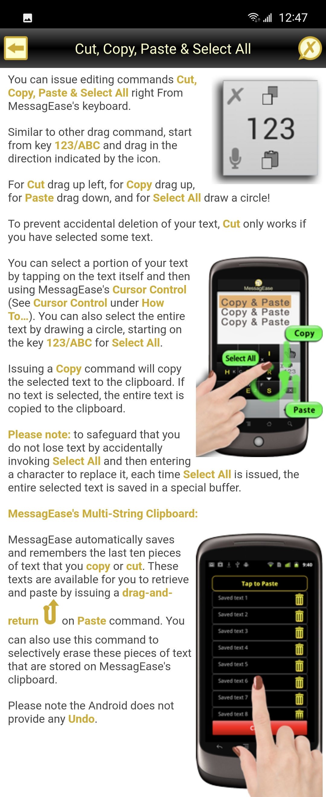
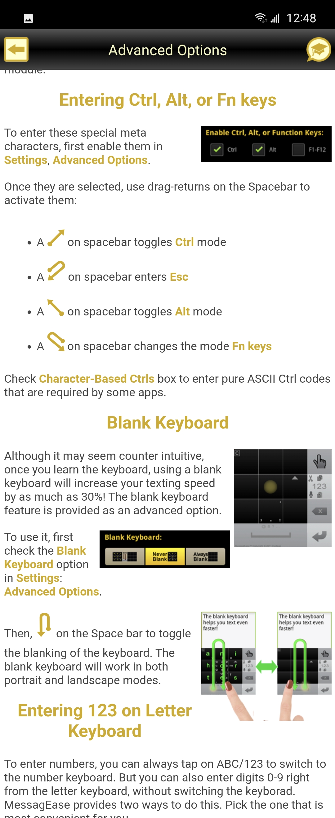
For everyday writing I like to use MessagEase. It’s highly ergonomic thanks to the 3x3 grid and deeply customizable. I’ve been happily using it for over a decade now (it continues to receive updates) and for the past 8 years I’ve been able to touch-type on it without looking at my fingers
The documentation is all in-app, so I’ve taken the liberty of screenshotting the relevant pages for illustrative purposes:


Oh hey, I actually looked into alternative keyboards on Android the other day. Stumbled on Unexpected Keyboard, where the “press and hold” alternative symbols are accessible by swiping in the direction of it from its key instead. I think because it’s FOSS, they’ve also added a whole bunch of other keyboard support such as ctrl and some unicode keys.
I’ve found that I prefer to tap and hold to get the alternative keys, but I loved the additional keys it had that were within easy visibility. Though it did look quite clustered that the default Samsung keyboard that I’m used to.
deleted by creator
Same, best keyboard of all time.
You can also swipe along the volume bar
I find that super jumpy and a pain though.
I’d be interested in trying the system this guy is talking about. Anyone know if Eloquent is installable at this point?
The last section makes me think they can’t be bothered to take it into production. It’s weird; they spend all these words describing the problem and their solution then conclude with but 🤷♂️ no-one really cares.
Not really that weird.
It’s a common occurrence.
It’s a passion project that someone or a team spend a lot of time and energy on, likely thinking that the advantages of implementation will be so obvious that it’ll just be out into production based on its self-evident merits or improvement on existing practices.
Then it hits the concrete wall of reality, where there’s actually lots of friction and barriers in the process of trying to get the project into production and implemented. Management just doesn’t want to go ahead with it for whatever reason, and people don’t seem to be as enthusiastic about it and clamoring for it as the dev/team thought they would be, despite it solving a number of common issues they have with a product/service.
So the dev/team can either go home and forget about it, starting a new project, or write a manifesto remembering and defending the project they’ve spent many hours on.
It almost reads like a PhD thesis defence. At least that PhD then gets recorded, filled and archived, and despite it potentially having no immediate real-world impact, possibly someone down the line might access the extensive work and research already done here, and use it to further their own project, and fingers crossed that project has more success in making a real-world change than this one.
TL;DR: I imagine his management don’t want to go ahead with implementation for whatever reason, but because the research and any coding was done during his time at Google, he can’t just go and create his own app or implementation, or approach another more willing company for implementation. But by providing the research and element summaries, and points for how a better system might work, he not only memorialized his hours of work on a “dead end” project, but allows others in a less captive situation the advantage of taking his summary and using it to actually try to get change happening elsewhere.
On Android, I’ve used Hacker’s Keyboard since my earliest days on the platform and still use it to this day. It provides a full 5-row layout including modifiers, control keys, and arrows. It works exactly like you’d expect it to work. I can’t stand the default keyboards.
On mobile Linux, there is a keyboard called squeekboard that lets you define the key layout using .yaml files. The default layout is pretty limited, but I created my own portrait and landscape 5-row layouts also with modifiers, control keys, and arrows that makes the experience so much better. I’m typing this on my custom portrait layout. I often edit code and use the terminal with this layout too. phone keyboards are bad because of bad design choices, not because touch keyboards are inherently bad.
deleted by creator
postmarketOS on a OnePlus 6T. I have used various other distros on my PinePhones as well.
I can’t find “hacker’s keyboard”. I searched f-droid and the play store…
I know for sure it’s on F-Droid. I installed it fairly recently (like a month ago). Pretty sure the name is “Hacker’s Keyboard” and you need the apostrophe in the search or F-Droid won’t find it.
You’re right, I needed that apostrophe… Thanks!!
This is the store link: https://f-droid.org/packages/org.pocketworkstation.pckeyboard/
I have tried it multiple times with various devices, going back to the Palm Pilot. Modern Android does the best of any environment I’ve tried, but I still consider it unusable for editing. There may be some clever, outside-of-the-box solution that would make it viable, but so far there hasn’t been enough demand to drive that kind of development.
What REALLY irks me is that the gboard keyboard on Android is context-sensitive. No, I don’t want to have a shortcut for “.com” when long-pressing the period key while typing an address, I want to type a fscking dash!
Seriously, who thought a .com shortcut was necessary? Get rid of uniquely useful keys for stupid gimmicks that save a few seconds at most? Bad design.
You can set it to have symbols on long presses. Saves digging around for most common ones

I used to have a Blackberry Pearl which had a seemingly unique keyboard layout of two characters per key. It was the perfect compromise between the old school T9 and qwerty. That keyboard (with physical keys nonetheless) combined with that little trackball thing, it was easily the best handheld device I’ve used for text entry and editing. I know the article was focused on editing and not necessarily text entry but it really got me thinking. By doubling up and having two characters per key, it would open up a big chunk of real estate for things like cursor keys and other shortcuts.
I love typing and using keyboards in general. I love using Ctrl and Shift with the arrows, end & home, all of it. I would love to love doing it on my phone too.
This issue was solved by a 3rd party extension available on Cydia for Jailbroken iPhones a long time ago called SwipeSelection. Apple decided to copy the feature but implement it in a way (hold the space bar and scroll) that makes it usable thus useless. The time it takes to hold the spacebar to enable Apple’s swipe thing makes it unpractical, the tweak was way better.


